amazon brand store
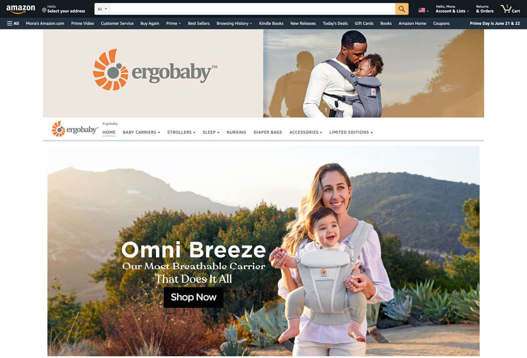
The Ergobaby Amazon Store was built from the ground up to deliver an immersive, streamlined shopping experience. It showcases Ergobaby’s entire product range with striking campaign images, while also telling the brand’s story through thoughtful, curated content.

Objective
To create a comprehensive Amazon storefront for Ergobaby that ensures consistency across all product pages, enhances customer experience, and reinforces the brand’s identity through engaging visuals and organized content.
concept & visual
The store design emphasizes a clean and visually engaging layout. Bold campaign images introduce each section, while customer-generated content brings an authentic, community-driven feel. Each image is linked to its respective product page, ensuring a seamless user journey. A+ content assets were developed for both product and category pages, adding enhanced visuals and detailed information to elevate the shopping experience.


