flatlay
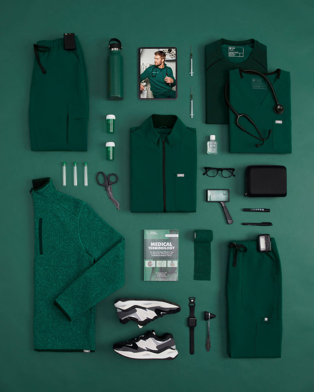
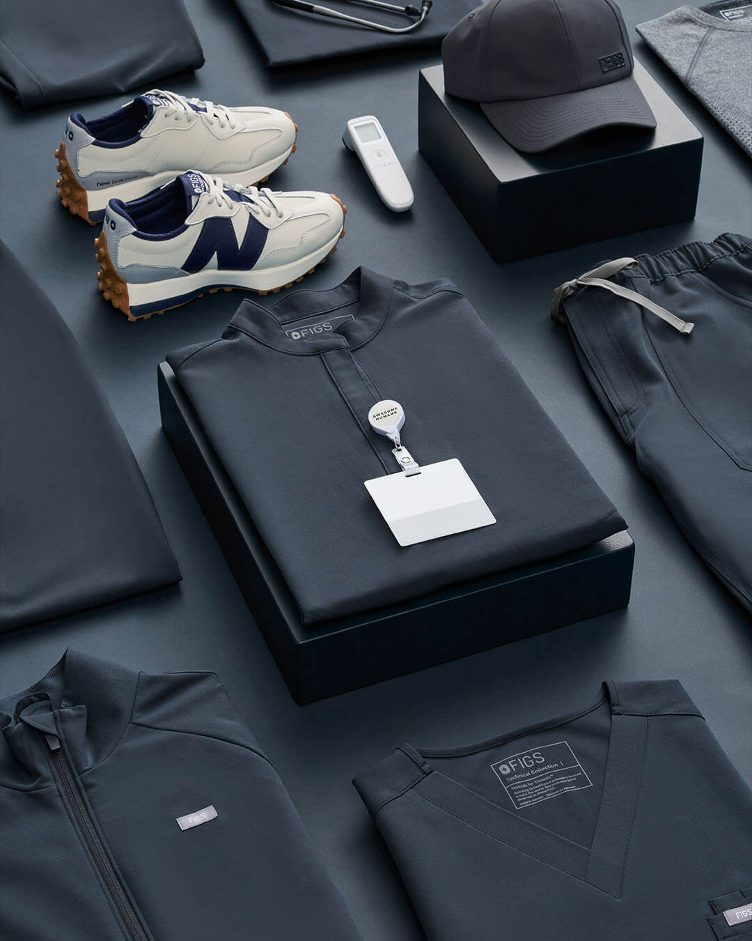
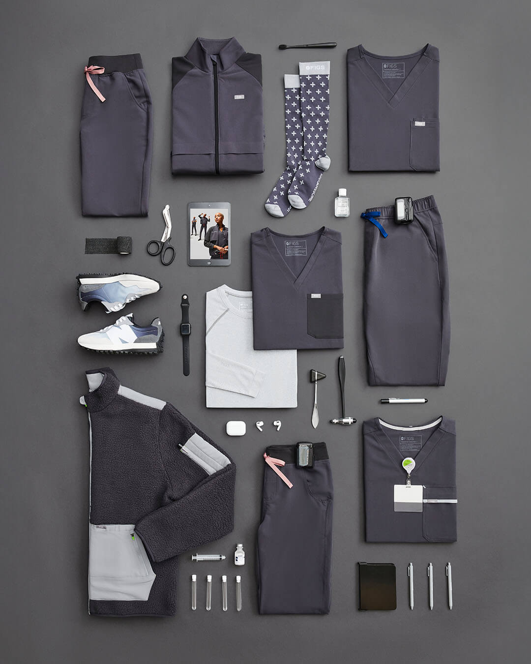
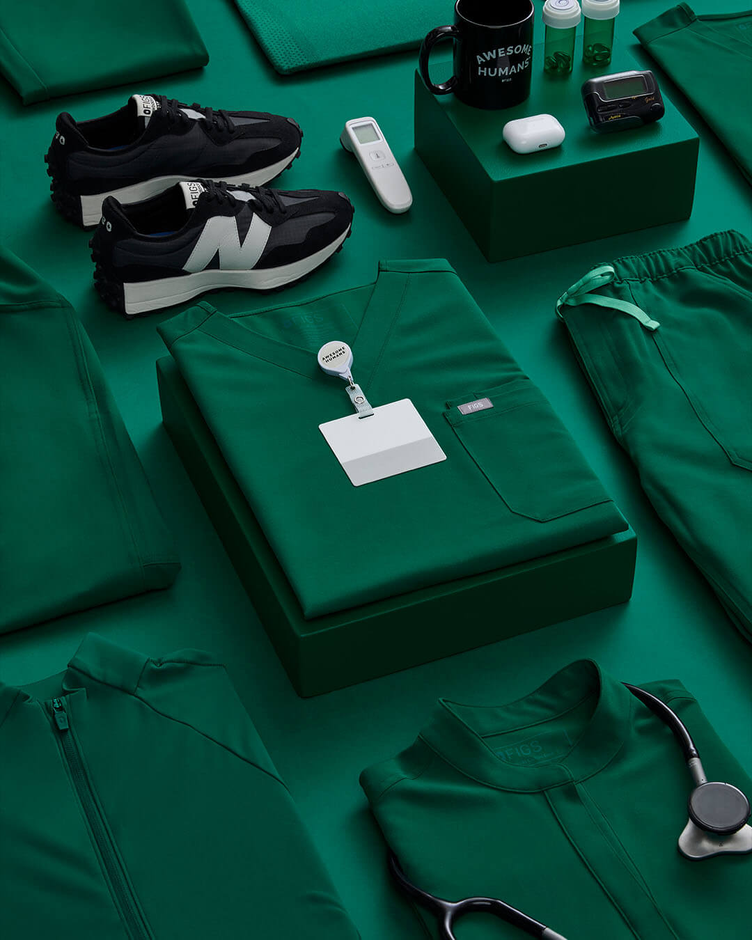
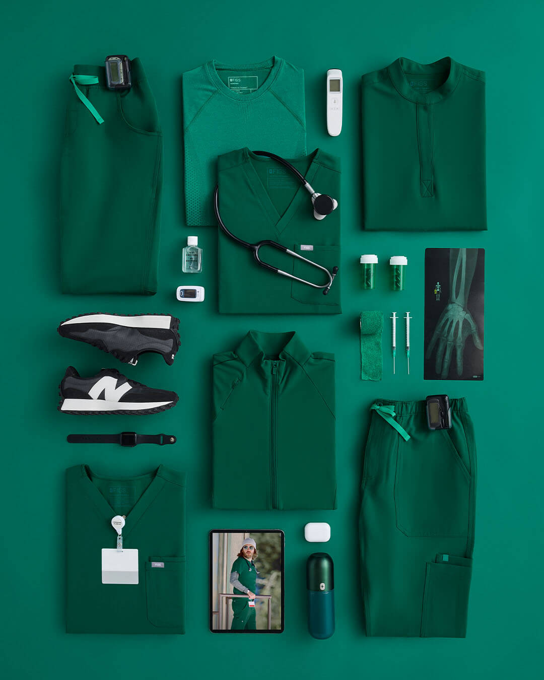
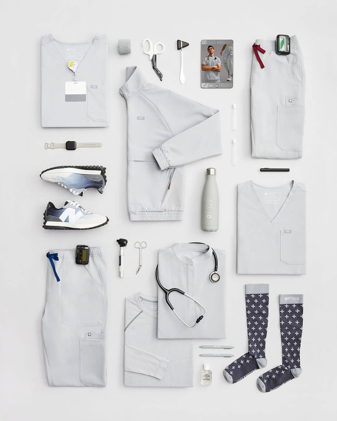
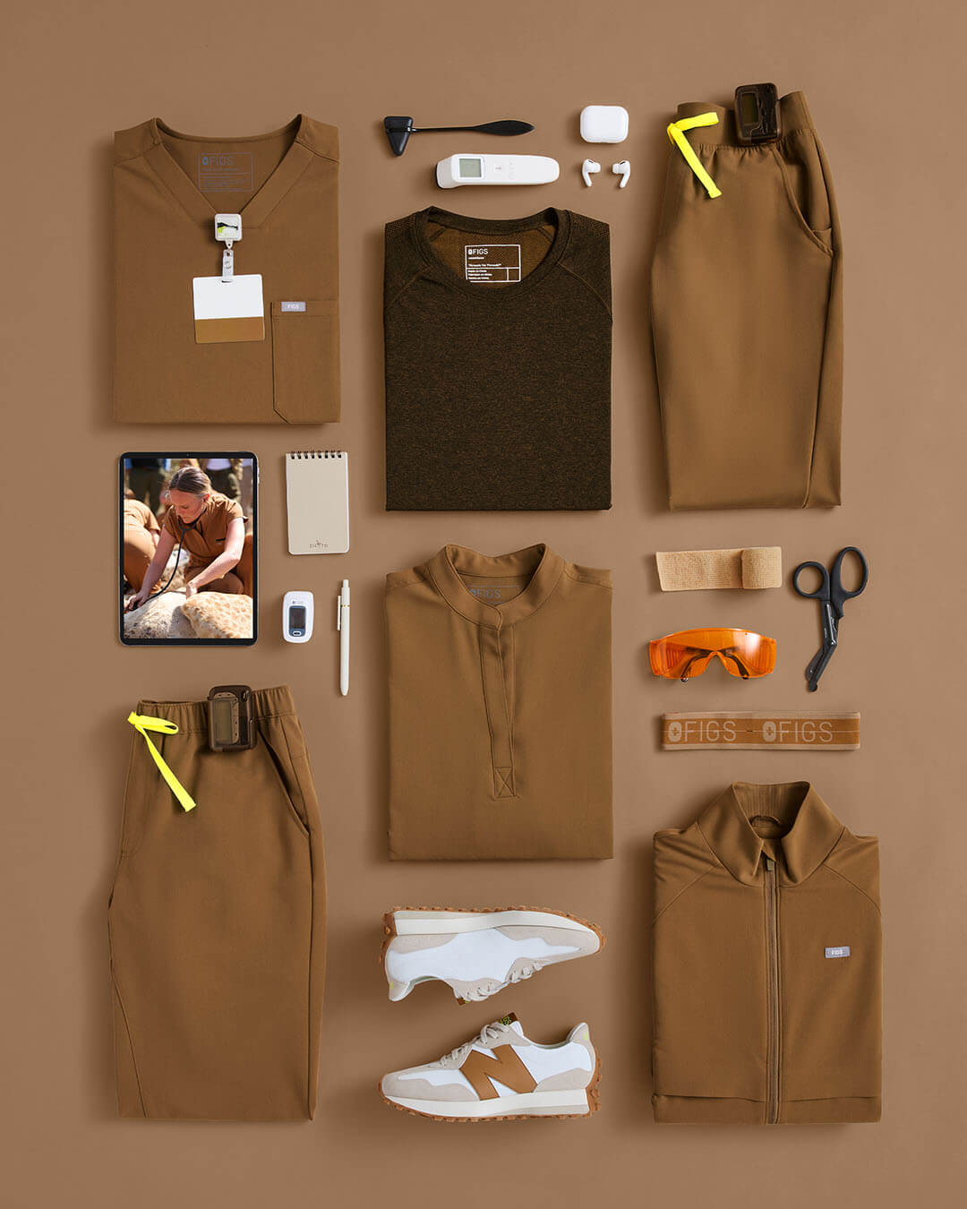
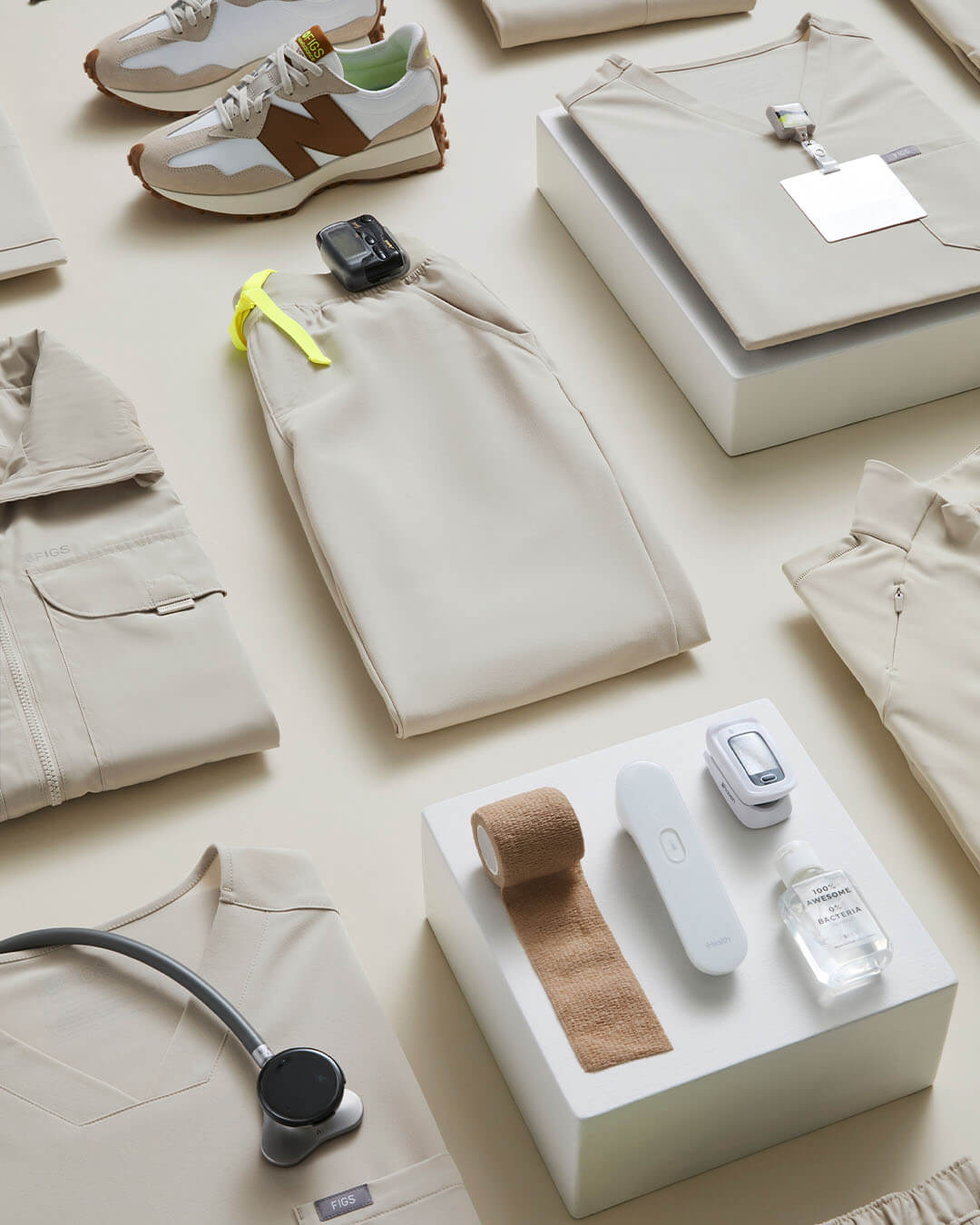
The Flatlay Project showcases a series of meticulously arranged medical essentials, highlighting new product launches with a modern, visually cohesive aesthetic. These assets are designed to support a variety of channels, including site assets, social media, ads, and broader marketing initiatives, providing a versatile and dynamic representation of the brand's products.
Client
figs
role
art director
Category
Art Direction
Objective
To create a visually compelling flatlay arrangement of medical essentials and new product launches that enhances brand identity across multiple platforms. The goal is to produce versatile assets that effectively communicate the quality and functionality of the products while aligning with the brand's marketing strategy.
concept & visual
The design emphasizes clean, well-organized flatlays, thoughtfully combining medical essentials with newly launched products. Each element is carefully arranged to create a sense of balance, drawing attention to the key features of the new launches. This high-impact visual approach effectively supports site assets, social media content, ads, and other marketing materials, enhancing the presentation of new color launches.





team
Art Direction: Anna Yung, Mona Ruan
Photographers: Ross Morrison, Nate Hoffman
Retouchers: Salvador Ceja Garcia, Daniel Hermosillo, Rosalie Andrea
